In the robotic industry, your landing page is key to turning visitors into buyers. This guide shows you how. You’ll discover the top strategies from the industry’s best-performing pages. We’ll cover everything from clear, direct calls-to-action to designs that grab attention. Simple and effective, these tips are designed for you, whether you’re new or experienced.
Ready to make your robotic business’s landing page a success? Let’s get started.
5 Key Elements of a High Converting Landing Page:
To make your robotic company’s landing page a lead-magnet, you need to nail a few key elements.
1. Clear CTAs:
Your call-to-action should stand out and speak directly to your visitors. Use action-oriented language like “Discover Our Robotics Range” or “Get Your Free Robotics Guide”. This clarity guides visitors towards the next step, making it more likely they’ll engage.

2. Engaging Visuals:
You’re in the robotics field – show it off! Use high-quality images or videos of your robots in action. This visual appeal grabs attention and makes your products more relatable and desirable.

3. Concise Messaging:
Keep your message short and to the point. You want to quickly tell your visitors what you offer and how it benefits them. Avoid technical jargon – remember, clear and simple wins the race.
4. Social Proof & Trust Badges:
Display testimonials, client logos, or case studies. These build trust and credibility. When potential customers see others have had success with your robots, they’re more likely to convert.

5. Color Schemes:
Use colors that align with your brand but also draw attention to key elements like your CTA button. Contrasting colors can make a significant impact here.
Remember, the goal is to keep your visitor’s journey on the page smooth and compelling. You want them to feel informed, intrigued, and ready to take action by the time they reach the bottom of your page.
High-Converting Landing Page Examples:
Let’s make your robotics company stand out with a landing page that gets results:
1. Catchy Headline:
Start with a bang! Use a headline like “Make Your Factory Smarter with Our Robots” to grab attention right away.
2. Cool Pictures or Videos:
Show off your robots with awesome visuals. Let people see them in action, making things easier or more fun.
3. Simple Words:
Use easy words to tell people how your robots can help them. Highlight the big wins like saving time, cutting costs, or solving problems.
4. Clear Call-to-Action (CTA):
Make your next step effortless. Click on large, clear buttons labeled “See It in Action” or “Get Yours Now”. Boost your clicks with a Pay Per Click (PPC) strategy. This way, every click on your call-to-action buttons can lead to more conversions for you.

5. Real Stories:
Share stories or feedback from happy customers. This shows that real people love your robots.
6. Try It Out:
Add cool features like a demo or a tool that lets visitors play around and see what your robot can do for them.
7. Details Matter:
Give the tech-savvy folks the nitty-gritty details they crave about what your robot can do.
8. Works Well With Others:
Tell people how your robot fits right into what they’re already doing. This makes it easier to say yes.
9. Answers Ready:
Got questions? Have answers ready on your page to clear up any doubts.
10. Show Off Your Wins:
Flaunt any awards or shout-outs you’ve gotten. It’s like saying, “Don’t just take our word for it; we’re recognized experts.”
Keep tweaking your page based on what your visitors do and say. The goal? Make every visit count by guiding them smoothly towards picking your robot.
Top Robotics Companies: Mastering the Art of Landing Pages
Let’s dive into real-world examples from robotics companies that know how to make a splash with their landing pages:
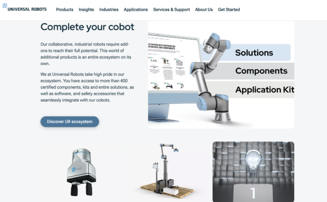
1. Universal Robots:
They keep it simple. You’ll see how their robots can easily fit into what you’re doing, with big, bold buttons urging you to dive deeper.
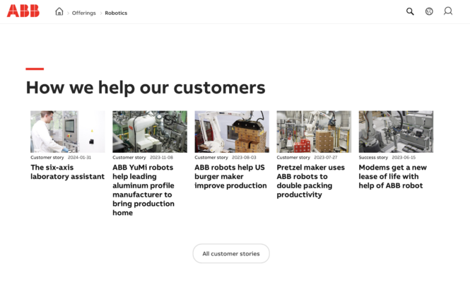
2. ABB Robotics:
ABB lays out all the facts with case studies and detailed info on their robots. They also highlight their awards, letting you know you’re in good hands.
3. Boston Dynamics:
Watch robots like Spot and Atlas in action right when you land on their page. It’s all about showing you what these robots can do with cool videos and clear, catchy headlines.
4. iRobot:
Home of the Roomba, iRobot makes it clear why you’ll love their robots. They use easy-to-understand language and share lots of happy customer stories.
5. DJI:
Famous for drones, DJI’s pages are full of awesome images and videos. They make it super easy for you to learn more about their tech with straightforward CTAs.
6. KUKA Robotics:
If you’re into the techy details, KUKA’s got you covered. They mix technical specs with engaging visuals, plus they offer resources you can download.
7. Fetch Robotics:
They show off their robots working in real warehouses and factories. Fetch uses success stories to prove their robots make things more efficient.
8. Sphero:
Sphero’s site is fun and colorful, perfect for their educational robots. They use simple words to explain how their robots make learning cool.
9. Anki:
(Even though Anki closed down, their approach was spot-on.) They made robots with personality and showed them off with demos that were easy to understand and interact with.
10. Zebra Technologies:
They help businesses manage inventory with robots. Their site answers all your questions up front and shows you exactly how their robots fit into your current setup.
These companies make sure you see the best of their robots the moment you land on their pages. They use clear language, show off with visuals, and make it super easy for you to take the next step, whether it’s learning more or getting in touch.
Boost Your Robot’s Landing Page: Proven Conversion Tactics
Let’s dive into what makes some landing pages turn visitors into buyers like magic, especially in the world of robots. We’re talking about tactics that have already proven their worth in other industries but are just waiting to boost your robotic company’s success.

1. Use Urgency Like a Pro:
Ever seen those “Only 2 left at this price!” alerts? That’s urgency making you want to act fast. Imagine telling your visitors, “Grab our latest robot at a special price – offer ends in 24 hours!” It makes people think they need to act now or miss out.
2. Make Your CTA Button Impossible to Ignore:
Successful landing pages have something in common: their CTA buttons are loud and proud. Yours should say something like “Get Your Free Robot Demo Now” in big, bold letters that catch the eye. Place it where it can’t be missed, and make sure it tells your visitors exactly what to do.
3. Show Them the Money:
People want to know what’s in it for them. If your robot can save them time, increase their production, or cut costs, spell it out clearly. Use real success stories to show how others have benefited from your robot. Think, “See how Company X boosted production by 30% with our robot.”
By adopting these strategies, you’re not just selling a robot; you’re offering a solution to a problem, an opportunity to improve, and a reason to act now. This approach doesn’t just attract attention; it converts visitors into leads and customers. So, take these tips, apply them to your robotic company’s landing page, and watch your conversion rates climb.
Common Pitfalls:
To make your robotic company’s landing page really work for you, focus on making it simple and direct. Here’s what to steer clear of:

1. Too Much Info:
Don’t overload your page with text or options. Stick to the essentials.
2. Ignoring Speed:
A slow page turns people away. Make sure yours loads quickly.
3. Skipping Tests:
Try different versions of your page to see what works best. Don’t just settle for the first draft.
4. Forgetting SEO:
Help people find your page. Use the right keywords.
5. Losing Leads:
Have a plan for what happens after someone clicks your CTA. Keep in touch with emails or offers.
Remember, your landing page is your first impression. Make it count by keeping things straightforward and focusing on what your robot does best. Avoid common mistakes by testing and optimizing your page for both speed and search.
Conclusion:
To boost your robotic company’s landing page, focus on what works: clear actions, eye-catching visuals, and straight talk about your robots. Keep it simple, fast, and to the point. Learn from the pros, use winning tactics, and avoid common traps like clutter and slow load times. Test and tweak to perfection. This is your blueprint for turning visitors into buyers. Ready to see your robots fly off the digital shelves? Start now, and watch your page convert like never before.
7 Digital Strategies to Market Your Robotics





I can not wait to read far mоre from yօu. This is really a great web site.